Personally, I find Instagram’s editing tools quite handy when it comes to enhancing my pictures. It is more of a quick fix when you don’t have your laptop with you to use photoshop. Certainly the quality of the pictures will decrease via Instagram but they are useful solely for the purpose of posting onto Instagram.
Here are some of the tools I use on Instagram:
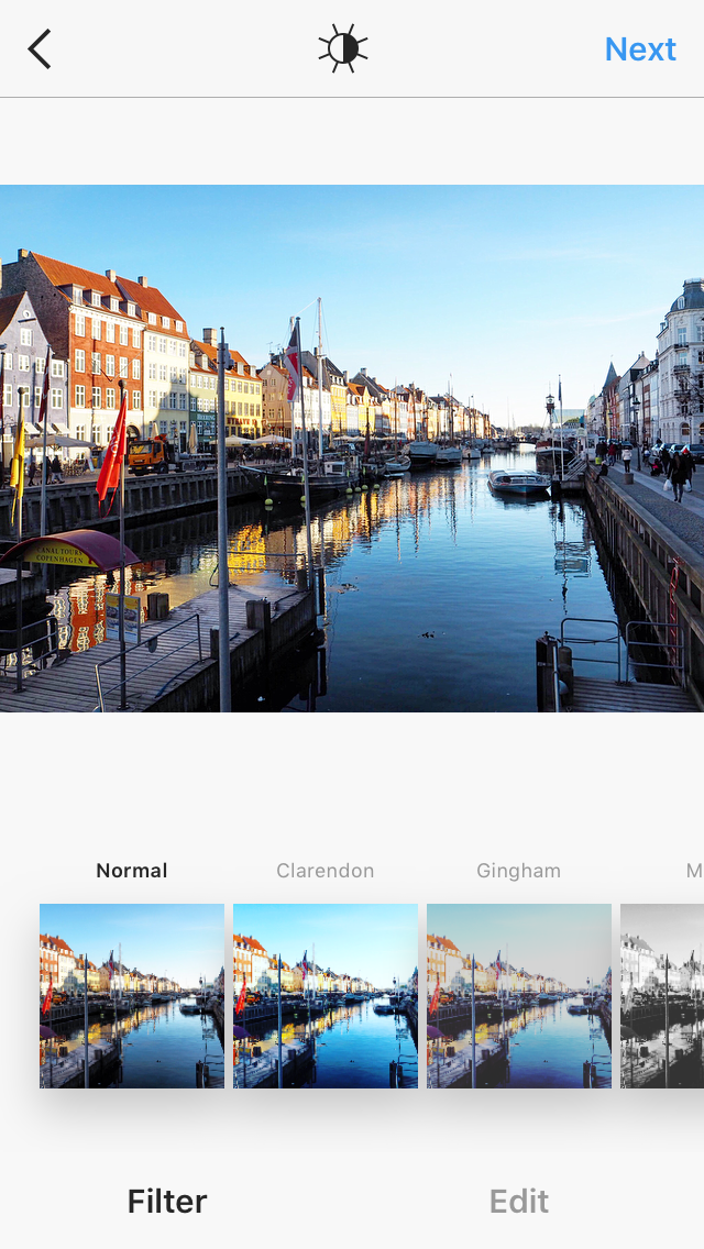
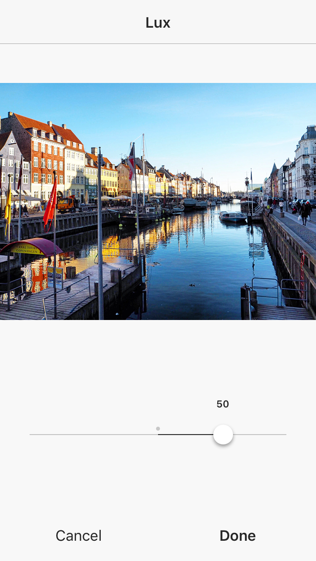
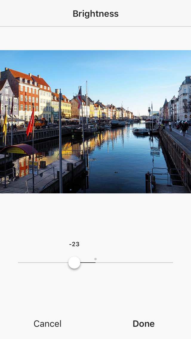
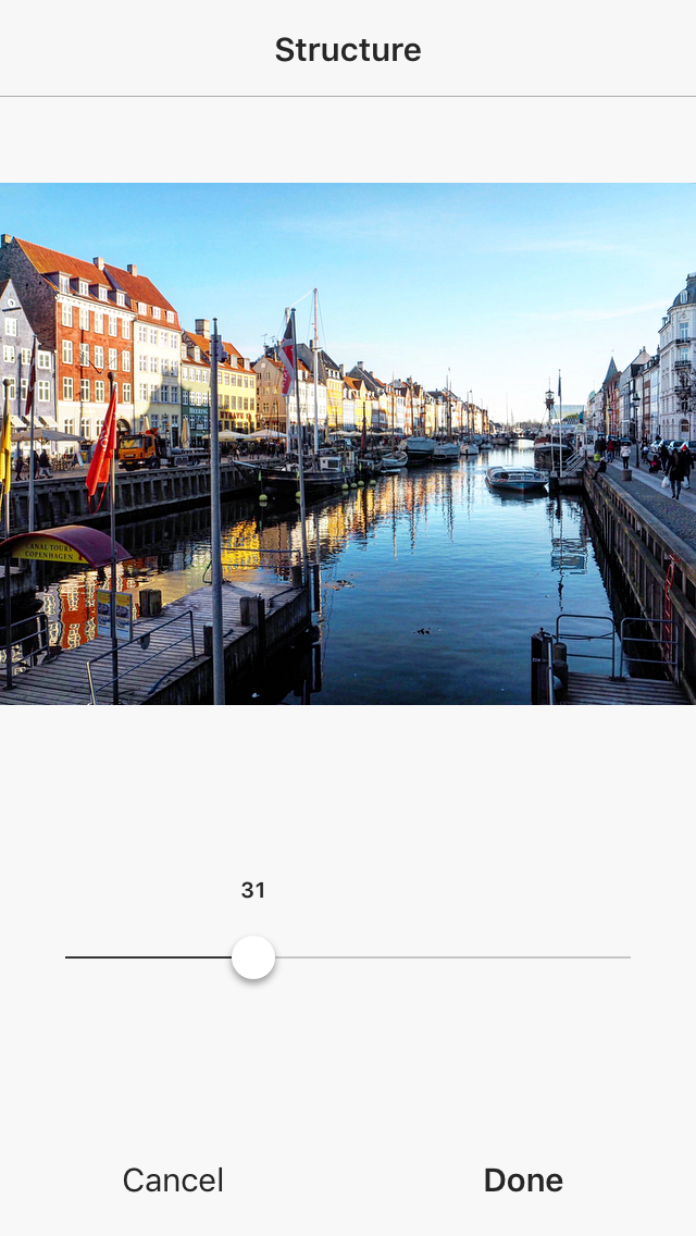
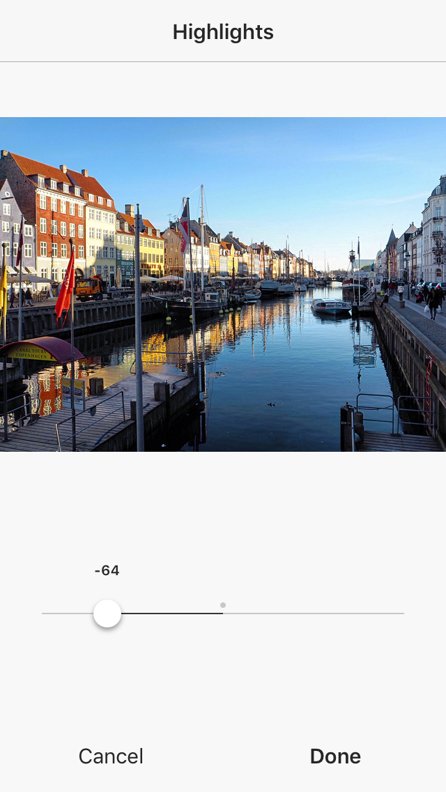
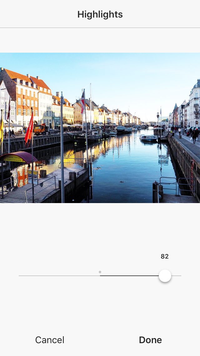
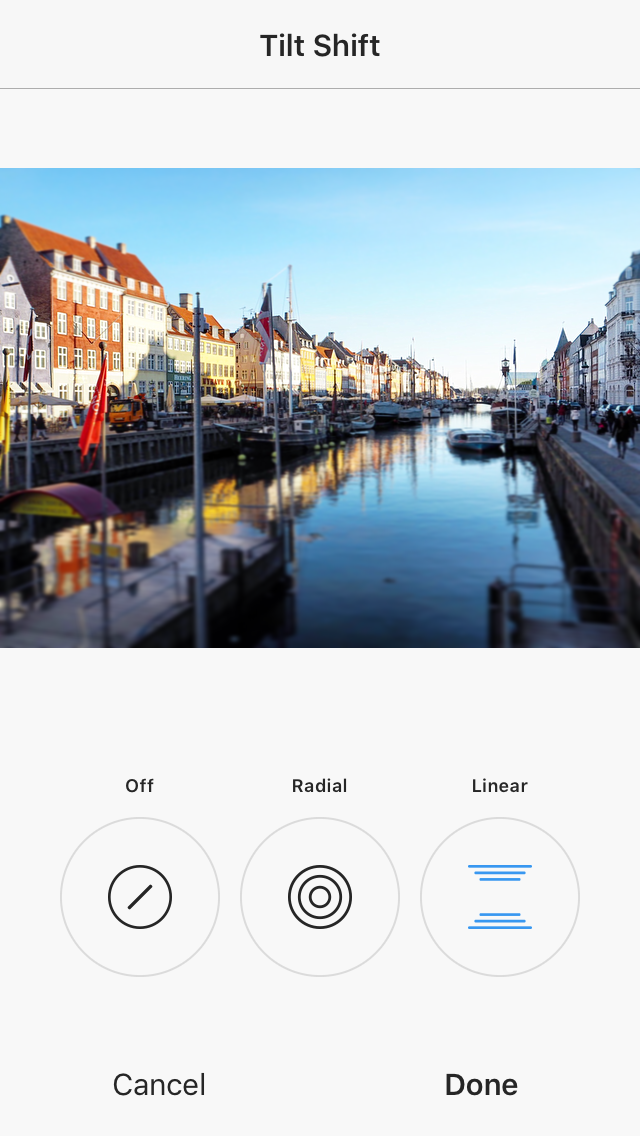
select a photo from your camera roll – here i’ve chosen one from Copenhagen (Denmark)then I’ll press ‘EDIT’, moving away from the ‘FILTER’ pageyou’ll see all the different tools you can use to edit your photosthe first one that I often use is ADJUST – it is hard to take a perfectly straight photo using your hand so most likely you’ll have to adjust the photo in some way to straighten it; there are three tools available and they all adjust the photo in different ways; move from left to right to find out which adjustment makes your photo look bestas you can see, i’ve made some adjustments to my photo and it is straighter now (it also tells you the degree which your photo is straighten)next, the LUX function is located at the top of the screen; just press on it and it’ll automatically increase lux by 50 – usually it is just the right amount for you photo (this tool brings out the contrast in colours neatly)then i’ll play with BRIGHTNESS – you can either show to brighten or darken your photoI’ll use ‘STRUCTURE’ to allow the things (eg. buildings/people) in the photo to look sharper – usually do not use TOO much of it unless you like your photos a certain waythe WARMTH function makes your photo either more blue or more red/orangey; when you increase warmth, it’s like increasing sunlight (this function comes in handy when you’ve a photo with TOO much sunlight and you can decrease the warmth)the ‘SATURATION’ function brings more colour to your photo but DO NOT use too much of it; if you find your photo too bright in a colourful sense, you may wanna decrease the saturation slightlyFADING allows your photo to look less sharp because the colour gives off a more vintage feel; some people love to edit their photos with this functionHIGHLIGHTS adjusts the colour & brightness to the top part or background of the photo; this is the darkened effect (look at the sky)and this brightens the skySHADOWS on the other hand adjusts the bottom part or foreground of the photo; this brightens the foreground (look at the water)this however darkens the foreground, making the reflection in the water clearerfinally, TILT SHIFT if you might need will blur specific parts of the photo you want it to; for example, I’ve applied it to blur the bottom part of the photo
There is no perfect formula to edit photos, most of the time is trial and error for the combination that can produce the best effect. I use Lux, Brightness, Structure, Highlights and Shadow for all my photos as I find them working well together. It really depends on how you want your photos to turn out and I hope this is useful! 🙂
here’s the end product with the application of all the above tools I’ve used~the difference is not super huge because I didn’t want to edit too much of the photo as the original colours were already fairly nice